
인류의 건강과 생명공학 발전을 위해 봉사하는 기업 드림셀
We Serving the Health and Biotechnology of Humanity
We Serving the Health and Biotechnology of Humanity
CytoFLEX LX Flow Cytometer - 20 marker Immunophenotyping
CytoFLEX LX 유세포 분석기에 적합한 20 개의 마커 패널을 소개합니다.
Cytobank platform에서 viSNE, FlowSOM, SPADE 를 이용하여 Data를 Visualization 할수 있습니다. Kaluza 분석을 통한 Manual gating strategy가 나타나고, 이 결과를 FlowSOM의 clustering 부분과 비교해 볼 수 있습니다.1,2 이러한 알고리즘의 특징은 실험자가 manual gating에 의해 알고있던 sub-population에 대한 편견을 감소시키는 것입니다. 또한 연구자로 하여금 기대하지 못했던 phenotype들을 발견할 수 있게 합니다. Manual gating 과 비교했을때 장점은, Machine learning 알고리즘을 사용하여 고차원 데이터 세트의 철저한 분석에 필요한 시간이 단축된다는 것입니다.
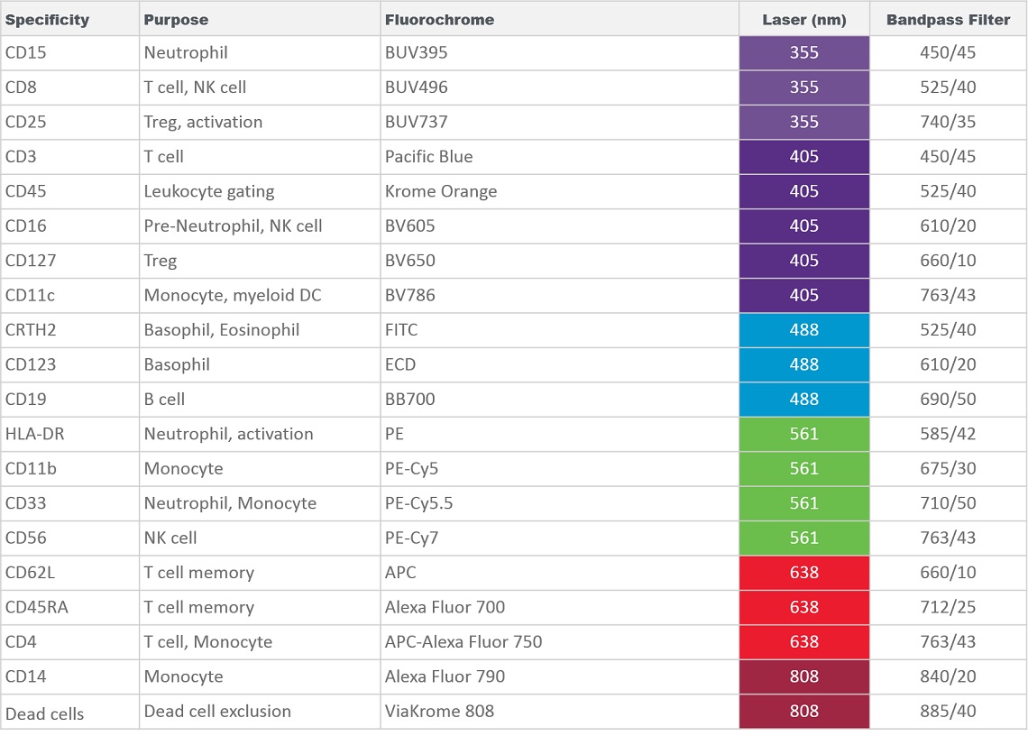
아래 소개하는 데이터를 생성하기 위해서, 표준 절차(Part Number IM3648)에 따라 Versalyse로 적혈구 세포 용해 전에 혈액 샘플을 아래에 설명 된 20 색 항체 칵테일 (Table 1)로 염색하였습니다. 염색 된 샘플을 6개의 레이져를 가진 CytoFLEX LX 유세포 분석기에서 측정하였습니다. 각 염료의 최적의 측정을 보장하기 위해서 아래의 필터구성을 적용하였습니다.
Table 1. Panel Composition for 20 marker Immunophenotyping using the CytoFLEX LX Flow Cytometer.
Log scale에서 Compensation 및 데이터 변환은 “Kaluza Analysis 소프트웨어”를 사용하였으며 Compensation 된 데이터는 Kaluza Cytobank Plugin을 사용하여 “CytoBank 플랫폼” 으로 내보냈습니다. Kaluza Analysis는 2개의 파라미터를 그린 그래프에서의 gating과 manual population 식별에 활용하였습니다.
데이터 분석을 위해 machine learning 에 앞서, debries, doublet들, 죽은 세포들 또는 그외에 원치 않는 이벤트들은 미리 제거하였습니다. 이러한 이벤트들은 다운 스트림 분석에 있어서 영향을 미치는 정보들이 아니기도 하고, 적절하게 제거하지 않으면 오히려 부정적인 영향을 미치고 통계 결과를 혼란스럽게 할 수 있습니다. 원하는 데이터 시각화 및 연구 목적에 따라 추가 분석을 위해 관심있는 population들을 미리 파악하는 것이 좋습니다(Figure 1).
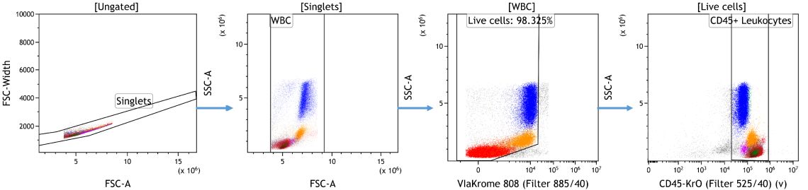
Figure 1. Data Cleanup in Kaluza Analysis. Doublets were excluded based on forward scatter signal area versus height followed by gating on white blood cells based on forward and side scatter characteristics. Cells negative for ViaKrome 808 (Part Number C36628) were identified as viable and further classified as Leukocytes based on CD45 expression. Data analyzed using Kaluza Analysis Software. Plots are for illustration purposes only.
인간 말초 혈액 샘플에서 세포 서브 세트를 확인하기 위해서, 이전에 알려진 마커발현 정보에 기반하여 게이팅 전략을 Kaluza Analysis Software로 확인하였습니다.3
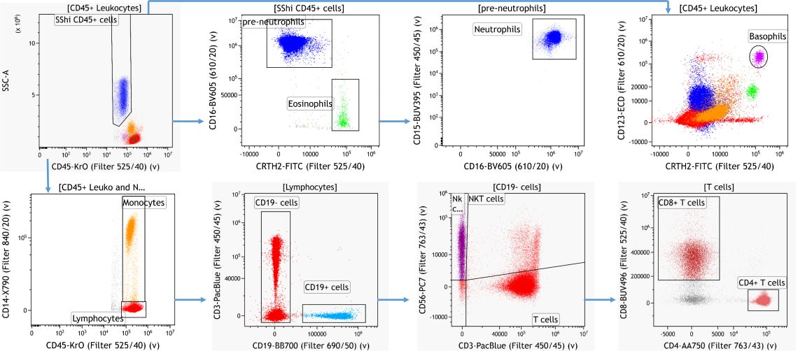
Figure 2. Knowledge-driven Identification of Major Leukocyte Subsets. Data analyzed using Kaluza Analysis Software. Plots are for illustration purposes only.
Machine learning 을 사용하면 편견없이 사전 지식과 무관하게 세포의 하위 집합을 식별 할 수 있습니다. viSNE와 같은 Dimensionality reduction 알고리즘은 단일 2D plot 1에서 high dimensional 데이터 세트에 포함 된 정보를 시각화 할 수 있습니다. FlowSOM과 같은 클러스터링 알고리즘은 마커 표현의 유사성을 기반으로 유사한 cell을 자동으로 식별하고 그룹화 할 수 있습니다. 2
데이터 세트에 대한 추가 분석을 위해, figure 2의 Manual gating 단계에서도 사용 되었고, 모든 게이팅 마커의 Dimensionality reduction으로 viSNE가 사용되었습니다. 이를 통해 11 개의 마커 (CD45, CRTH2, CD123, CD15, CD14, CD16, CD56, CD3, CD4, CD8, CD19)에 포함 된 정보를 시각화 할 수 있습니다. viSNE는 고차원 데이터를 2 차원으로 줄여 복잡한 결과를 신속하게 탐색하고 분석하여 시각화 할수 있는 방법입니다. 이것은 Flow cytometry 데이터에서, events/cells 의 분류를 생물학적 집단으로 하는 데 도움이 될 수 있습니다. 표현형적으로 유사한 세포는 서로 가깝고 일종의 섬(island)을 형성합니다. viSNE Map 결과의 등고선 그림(contour plot)이 Figure 3A에 표시되어 있습니다.
Dimensionality reduction 후, 세포를 12 개의 소위 메타 클러스터(metaclusters)로 자동 클러스터링하기 위해 FlowSOM 분석을 수행했습니다. Population이 지정된 marker에서 FlowSOM을 시행하고 viSNE map에 clustering 결과를 나타내면 데이터 평가를 조금 더 쉽게 할 수 있습니다. 결과를 최적화하기 위해 알고리즘 실행 설정의 추가 조정이 필요한 경우, 이 시각화된 결과는 여러 실행들을 반복 비교하고 클러스터링 데이터 분석을 위한 시작점을 제공 할 수 있습니다.
여기 분석 된 데이터 세트에서 viSNE 섬(islands)과 FlowSOM 메타 클러스터 사이의 좋은 상관 관계가 관찰 될 수 있습니다 (Figure 3B). 각 메타 클러스터의 표현형을 신속하게 식별하려면 클러스터링을 통해 FlowSOM 메타 클러스터의 히트 맵을 작성하는 것이 도움이 될 수 있습니다 (Figure 3C).
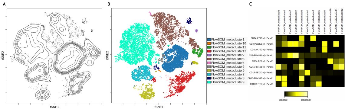
Figure 3. Subset Identification Using viSNE, FlowSOM and a Heatmap Display. A) Contour plot of the viSNE map B) viSNE map with FlowSOM metaclusters as overlaid figure dimensions C) Heatmap visualization of marker expression by FlowSOM metacluster. Data was compensated and logicle transformed using Kaluza Analysis Software and uploaded to the Cytobank platform through the Kaluza Cytobank Plugin. viSNE was run on 11 population-defining markers of 3 samples with 3000 iterations, 30 perplexity and 0.5 theta. FlowSOM settings are 12 metaclusters and 121 clusters with hierarchical consensus clustering. Plots are for illustration purposes only.
채널별로 색상이 지정된 dot plot들은 데이터 세트 내의 측정 강도에 따라 viSNE지도의 각 이벤트에 색상을 지정하는 데 사용되며, 지도의 점들이 서로 가까이 있는 이유 또는 이벤트간에 어떤 마커 표현 패턴이 유사한 지를 보여줍니다. Figure 4는 viSNE 맵에서 FlowSOM 메타 클러스터링과 비교하여 CD19, CD4 및 CD8에 대한 마커 발현을 보여줍니다.
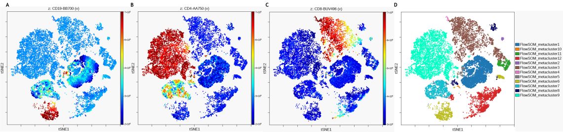
Figure 4. Expression Levels of Subpopulation Markers on viSNE Map. A) CD19 expression B) CD4 expression C) CD8 expression D) viSNE map with FlowSOM metaclusters as overlaid figure dimensions. Data was compensated and logicle transformed using Kaluza Analysis Software and uploaded to the Cytobank platform through the Kaluza Cytobank Plugin. viSNE was run on the Cytobank plugin on 11 population defining markers of 3 samples with 3000 iterations, 30 perplexity and 0.5 theta. FlowSOM settings are 12 metaclusters and 121 clusters with hierarchical consensus clustering. Plots are for illustration purposes only.
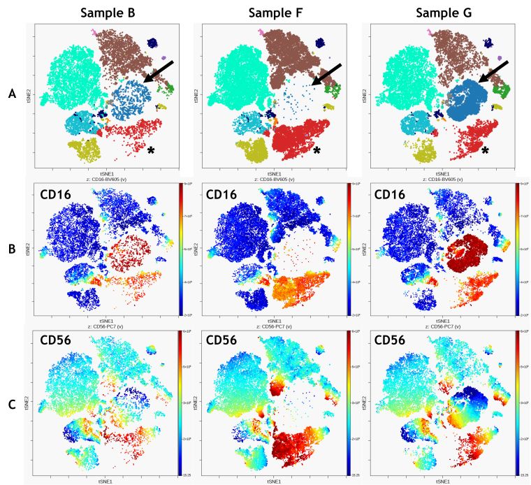
Figure 5. Comparison of 3 Samples. A) FlowSOM clustering overlaid on viSNE map, arrows indicate metacluster 1, asterick indicate metacluster 12 B) CD16 expression C) CD56 expression. Data was compensated and logicle transformed using Kaluza Analysis Software and uploaded to the Cytobank platform through the Kaluza Cytobank Plugin. viSNE was run on the Cytobank on 11 population defining markers viSNE was run on all CD45+ Leukocytes of 3 samples with 3000 iterations, 30 perplexity and 0.5 theta. FlowSOM settings are 12 metaclusters and 121 clusters with hierarchical consensus clustering. Data was compensated and logicle transformed using Kaluza Analysis Software and uploaded to the Cytobank platform through the Kaluza Cytobank Plugin. Further data analysis was performed on the Cytobank platform. Plots are for illustration purposes only.
viSNE와 FlowSOM을 결합하면 viSNE 맵에서 특정 마커의 표현을 시각화하여 샘플 간의 정성 비교를 향상시킬 수있습니다 (Figure 5). 비교 결과 메타 클러스터 1 (Figure 5 A, 파란색, 화살표)로 식별 된 CD16 + population은 샘플 G에서 두드러지지만 샘플 B나 F에는 거의 없습니다. (Figure 5A, 빨간색; 별표).
유사한 셀 그룹을 식별하는 데 사용할 수있는 다른 알고리즘은 SPADE입니다. SPADE는 " Spanning-tree Progression Analysis of Density-normalized Events “입니다. SPADE는 표현형 적으로 유사한 셀을 계층 구조로 클러스터하여 여러종류로 이루어진 샘플의 처리량이 많은 다차원 분석을 가능하게 합니다 (figure 6). SPADE에서 발견한 다양한 population (클러스터)에 실험자가 지정한 population threshold 값을 적용하기 위해 Bubble들이 추가 될 수도 있습니다.
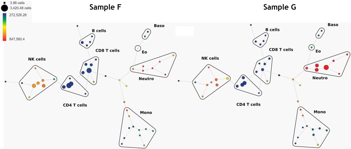
Figure 6. Comparison of 2 Samples, SPADE Trees Colored by CD16 Expression. Data was compensated and logicle transformed using Kaluza Analysis Software and uploaded to the Cytobank platform through the Kaluza Cytobank Plugin. SPADE was run on 11 populations defined with down-sampling to 10% and 50 nodes. Plots are for illustration purposes only.
Manual gating strategy를 확장하여 각 Leukocyte 집단의 더 깊은 Immunoprofile을 얻을 수 있습니다. 다시 말하지만, 일반적으로 이것은 보여지는 패턴에 대한 사전 지식을 기반으로합니다. CD4 + T- cell 서브 세트의 예가 Figure 7에 있습니다.
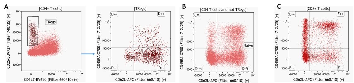
Figure 7. Knowledge-driven Identification of Regulatory T-cells and their Subsets. (A) CD4 T cell memory subsets gated on CD4+ T cells excluding Tregs (B) and CD8+ T cell memory subsets. Data analyzed using Kaluza Analysis Software. Plots are for illustration purposes only.
Plot들을 비교하거나 오버레이 기능 또는 Kaluza Comparison Plot 통계 결과로 샘플 간의 차이를 비교 할 수 있습니다 (Figure 8). 이러한 분석은 대부분 발생할 수 있는 차이점에 대한 가정에 의해서 주로 도출됩니다.
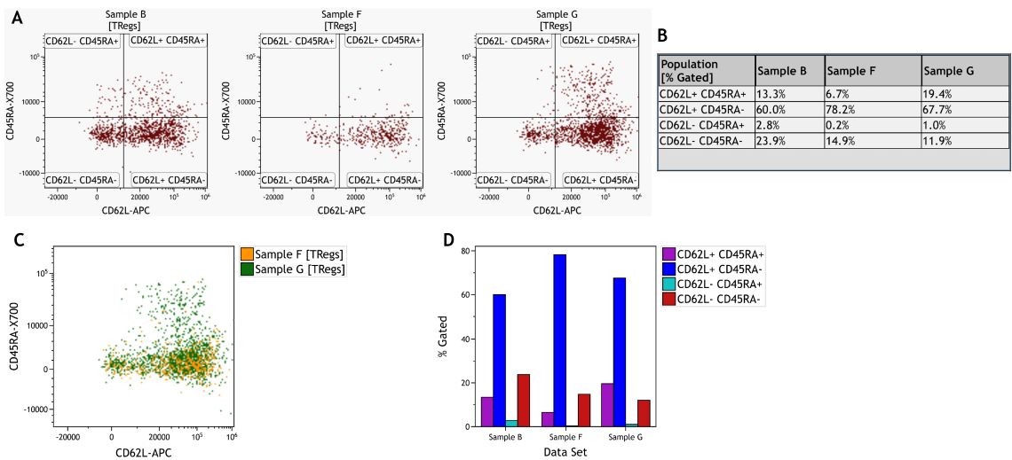
Figure 8. Comparison of Treg Subsets Across Samples. A) Individual dot plots per sample. B) Information Sheet with statistical results per sample and subset. C) Dot Plot Overlay of two samples. D) Comparison Plot visualizing % Gated per subset and sample. Data was analyzed using Kaluza Analysis Software. Plots are for illustration purposes only.
T 세포 서브 세트의 식별을 위해, CD3 + T 세포를 사용하여 viSNE 분석을 수행 하였습니다. Figure 9 A는 viSNE 맵에서 CD4 및 CD8의 표현을 보여줍니다. 이전과 동일한 Manual gating 방식 (Figure 7 참조)에 따라, CD45RA 및 CD62L 발현 패턴은 pan T 세포의 사분면 게이트를 사용하여 구분하였고, viSNE 맵 (Figure 9 B)에서 시각화하였습니다. 마지막으로 10 개의 메타 클러스터를 식별하기 위해서는 FlowSOM을 사용하여 계층적 클러스터링을 수행했습니다 (Figure 9C). Manual gating과 FlowSOM 클러스터링 모두 유사한 population을 구별합니다.
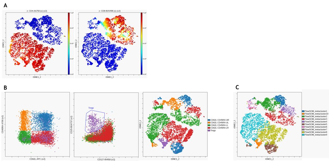
Figure 9. Unsupervised Analysis of T Cell Subsets. (A) viSNE was performed on the Cytobank platform with 2000 iterations and a perplexity of 50 and CD4 (left) and CD8 (right) expression are visualized on the resulting viSNE plot (B) CD62L and CD45RA expression patterns (left) as well as regulatory T cells (middle) were identified using manual gating and populations overlaid on viSNE map. (C) FlowSOM clustering was performed using hierarchical clustering on normalized data to detect 100 clusters and 10 metaclusters. Metaclusters are shown on viSNE map. Data was compensated and logicle transformed using Kaluza Analysis Software and uploaded to the Cytobank platform through the Kaluza Cytobank Plugin. Further data analysis was performed on the Cytobank platform. Plots are for illustration purposes only.
Figure 10은 FlowSoM과 Manual gating 으로 CD8 + 메모리 서브 세트 구별을 비교 한 것입니다.
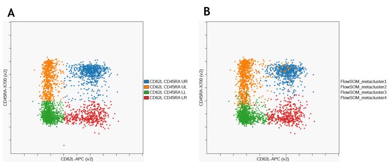
Figure 10. Comparison of CD8+ T Cell Memory Subsets Identified by Manual Gating. (A) and FlowSOM (B). Data was compensated and logicle transformed using Kaluza Analysis Software and uploaded to the Cytobank platform through the Kaluza Cytobank Plugin. Further data analysis was performed on the Cytobank platform. Plots are for illustration purposes only.
CytoFLEX LX에서 측정한 20 개의 마커 패널로 얻은 3개의 샘플에 대한 데이터로 leukocyte 과 T cell의 하위 집합에 대한 심층 분석을 식별하는 Manual gating 전략을 보여주었습니다. 2D viSNE 맵에서 고차원 데이터를 시각화하기 위해 viSNE를 사용하고, 샘플을 비교하기 위해 viSNE 와 SPADE를 사용하는 것을 논의해보았습니다. 마지막으로 FlowSOM을 사용한 자동 클러스터 식별을 Manual gating결과와 비교해보았습니다. viSNE, FlowSOM 및 SPADE와 같은 Muchine learning 시스템은 high parameter data를 시각화하고 세포의 하위 집합을 실험자의 편견없이 식별하는 데 도움이 될 수 있습니다.
Kaluza 분석 소프트웨어 사용에 대한 자세한 사항은 Kaluza IFU C10986을 참고해주세요. Cytobank 플랫폼 사용에 대한 자세한 사항은 support.cytobank.org에서 액세스 할 수 있습니다. 이 문서는 사용 지침을 대체하지 않습니다.
자세한 내용은 아래 Technical Notes에서 확인해보세요. Use Machine Learning Algorithms to Explore the Potential of Your High Dimensional Flow Cytometry Data Example of a 20-color Panel on CytoFLEX LX” “Leveraging the Combined Power of Kaluza and the Cytobank Platform” Technical Notes.
Amir ED, Davis KL, Tadmor MD, et al. viSNE enables visualization of high dimensional single-cell data and reveals phenotypic heterogeneity of leukemia. Nature Biotechnology. 2013;31(6):545-552. doi:10.1038/nbt.2594.
Van Gassen S, Callebaut B, Van Helden MJ, et al. FlowSOM: Using self-organizing maps for visualization and interpretation of cytometry data: FlowSOM. Cytometry. 2015;87(7):636-645. doi:10.1002/cyto.a.22625.
Ortolani C. Antigens. In: Flow Cytometry of Hematological Malignancies. John Wiley & Sons, Ltd; 2011:1-157. doi:10.1002/9781444398069.ch1.
Qiu P, Simonds EF, Bendall SC, et al. Extracting a cellular hierarchy from high-dimensional cytometry data with SPADE. Nature Biotechnology. 2011;29(10):886-891. doi:10.1038/nbt.1991.